Posts

Showing posts from May, 2017

Our first animated air quality maps

Image
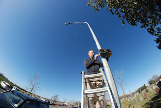
In a recent post we revealed our first map of local air quality , created solely from our network of low-cost air quality sensors - the ODINs (Outdoor Dust Information Nodes). This map is based on the average levels of airborne particles over nearly a whole month (August 2016). This data was collected by 16 ODINs spread across our study town of Rangiora. But we are actually recording data every minute. And the pattern of pollution can change rapidly. But really, you don't want to just take my word for it - the data is crying out to be animated. Luckily for us, NIWA has some pretty nifty visualisation software that we routinely use to create brilliant weather and climate graphics like the one below (I highly recommend 'liking' NIWAWeather on facebook).   So, what happens when we plug the ODIN data into the same computer system?   Below is our first attempt. It depicts two days of air quality data from 2016. Note the time in the top left corner.  

Air quality can be good as well as bad

Image
The CONA project exists because poor air quality is a big problem. It causes real discomfort, illness and impairs the health of thousands across New Zealand.  It also violates our views, tarnishes our towns and is generally the dirty little secret of our apparently clean, green country. But air quality can be good as well as bad. Especially in New Zealand. It is in the nature of our legislation that Regional Councils, like Environment Canterbury, will invest resources in monitoring air quality in locations where it can get bad, and report when it does indeed breach acceptable standards. But the flipside is that there is very little data, and even less media coverage, when and where our air quality is excellent. And excellent is exactly what it is most of the time across most of the country. Looking through the ODIN data from our 2016 pilot study I came across exactly such a time and place. Dr Sam Edwards installs an ODIN on a beautiful clear day in Rangiora Our study focussed on winter

Too hot, too cold, or just right?

Image
In a country where poor air quality is dominated by woodsmoke a study on air quality often turns into a study on home heating. And CONA is no exception. This is why from the start we asked Rangiora householders to allow us to put tiny temperature sensors in their homes, and especially on their woodburners. We previously posted on how we use this data to detect WHEN people are using their woodburners.It also allows us to collect data on how effective that heating is, and how good, or bad, each home is at retaining that heat. One of our miniature temperature sensors on a woodburner Well, that's the idea anyway. However, whilst looking at the 2016 study data we discovered that, like much in science, it ain't as easy as it looks. The data from the woodburners was highly variable between houses, probably depending on exactly where we put the sensor. Placing the sensor is tricky, because every home and every woodburner is different. We don't know what we're going to get unt